
How to Create a Chart/Graph - continued
Similarly, we do Bananas, then Pears, and we end up with the following pie chart: |
If we want to be even clearer, we could write the percentages of each type of fruit in the appropriate slice: |
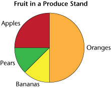
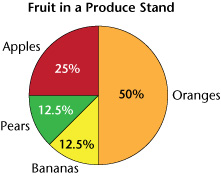
For this chart colours were used that best match each type of fruit. (Orange for oranges, red for apples, yellow for bananas and green for pears.) This makes it easier for people to read our pie chart since they will naturally associate the colour with the fruit.