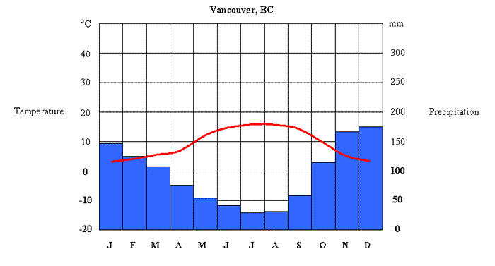
A climate graph displays yearly temperature and precipitation statistics for a particular location.
Temperature (oC) is measured using the numbers on the left hand side of the chart. The average temperature for each month is plotted on the graph with a red dot and the dots are then connected in a smooth, red line. Precipitation (mm) is measured using the numbers on the right hand side of the chart. The average rainfall for each month is plotted on the graph with a blue bar.
Here is an example for Vancouver, BC.
|
Jan |
Feb |
Mar |
Apr |
May |
Jun |
Jul |
Aug |
Sept |
Oct |
Nov |
Dec |
|
|
Temperature (oC) |
3 |
5 |
6 |
9 |
12 |
15 |
17 |
17 |
14 |
10 |
6 |
4 |
|
Precipitation (mm.) |
150 |
124 |
109 |
75 |
62 |
46 |
36 |
38 |
64 |
115 |
170 |
179 |