SOS Banner
    Tool 3
    SOS Toolbox

    Graphing—continued

    Step 5. The Trend

    At this point you should be able to see the relationship between the independent and dependent variables. You want to clearly show this relationship on the graph by drawing a best-fit line or curve, or by connecting the dots—but how do you know which one of these things to do? By plotting at least five dots, you should be able to see the basic shape, or trend, of a line appear.

    scaled graph

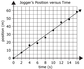
    In our example, the points are pretty close to a straight line. Draw a line of best fit through the data points so that the line is as close as possible to all of the points.

    To do this, draw a line through the data points so that the line is as close as possible to all of the points. *Helpful tip: using a clear ruler will allow you to see where the points are on both sides of the line that you are drawing. Another great idea is to use an uncooked piece of spaghetti to create your line of best fit!

    However, this is not always the case. If the points are closer to a curved line, then sketch in a curved line that matches the point. The curve should be smooth and it may or may not pass through all of the points.

    curved trend graph
    Return to Main Menu
    Table of Contents previous page   next page  

    All content copyright 2006 Province of BC