
How to Read a Chart/Graph - continued
Line Graph
A line graph is most useful for showing how a certain value changes. For example, the average monthly temperature:
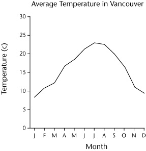
The title tells us that this line graph is about the average temperature in Vancouver, BC. The scale along the bottom tells us that the information is on a month-by-month basis. The scale along the left side tells us the temperature is measured in degrees Celsius. So this is a line graph that shows us the average temperature for a specific month in the city of Vancouver.