
How to Read a Chart/Graph - continued
Bar Graph
A bar graph is most useful for comparing the differing values of several items or categories. For example, the average annual income in several provinces:
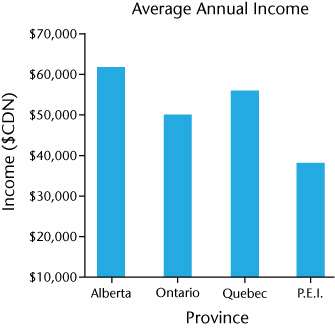
The title tells us that this bar graph is about average annual income and the scale along the bottom tells us that there is data for four provinces. The vertical scale along the left tells us that the data is in Canadian dollars.
A quick glance at the bar graph tells us that Albertans have, on average, the highest annual income and that PEI has the lowest of the four provinces.