
How to Read a Chart/Graph
Pie Chart
A pie chart is most useful for showing what percentage of the whole a particular item constitutes. For example what percentage of the population is between the ages of 19 and 35? Consider the following pie chart:
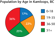
The title tells us that this pie chart is about the population of Kamloops, BC. The legend at the right tells us that there are four age ranges: 0-18 years old, 19-35 years old, 36 to 50 years old and 51 years old and older. Each colour corresponds to the matching colour in the pie chart to the left.
For example, the legend indicates that blue is for ages 0 to 18 and the blue “slice” shows us that 17% of the people in Kamloops are in this range. We can also see that people who are between the ages of 36-50 make up the most numerous group.
You may have noticed that this pie chart says nothing about the actual population of Kamloops - we can’t tell how many people actually live there! That’s okay because a pie chart is usually used to show the percentages of a whole, rather than the actual total numbers themselves.